First impressions are everything and your business card is no exception. Designing an eye-catching business card doesn’t mean that you have to go overboard with the details however. Sometimes it’s the understated, yet thoughtful touches that will help you stand out and make your calling card more memorable. Below are a few tips for designing a thoughtful and minimal business card.
– 5 Tips For Designing a Stellar Business Card –
1. Less is Truly More
Don’t go crazy overboard with the details! The information should be clear and easy to distinguish at first glance. Eliminate the unnecessary extras (do you really need to state “email” before listing the email address?). No one likes to be overwhelmed with information, so only include what’s critical.
2. Consider Readability
Plan on using tiny type on your business card? No problem – but be sure that it’s legible. If your text is tiny, you can still make it readable by using a strong contrasting color (such as black on white). You can also make it easier to read by choosing a serif typeface. Serifs were actually designed to help make letters and numbers easier to distinguish for the eye.
3. Handle with Care
When designing a business card, it’s a good idea to think about how someone will interact with it in hand. When I pick up a business card, I typically hold it by a bottom corner. Leave a bottom corner free of information so that no important details get covered by a thumb while being held.
4. Paper Quality is Everything
Even the most brilliantly designed business card will look unimpressive if printed on junky paper. The few extra pennies you spend on upgrading to a higher quality paper will go a long way. Your card will look and feel a lot more refined – it will also hold up better!
5. Leave Room for… Whatever
Blank space on a business card isn’t a bad thing! Whoever you just handed your card to might want to jot a few notes down about the amazing conversation the two of you just had. Leave a little room for note-taking. It’s also a good idea to choose a matte paper that will be easy to write on.
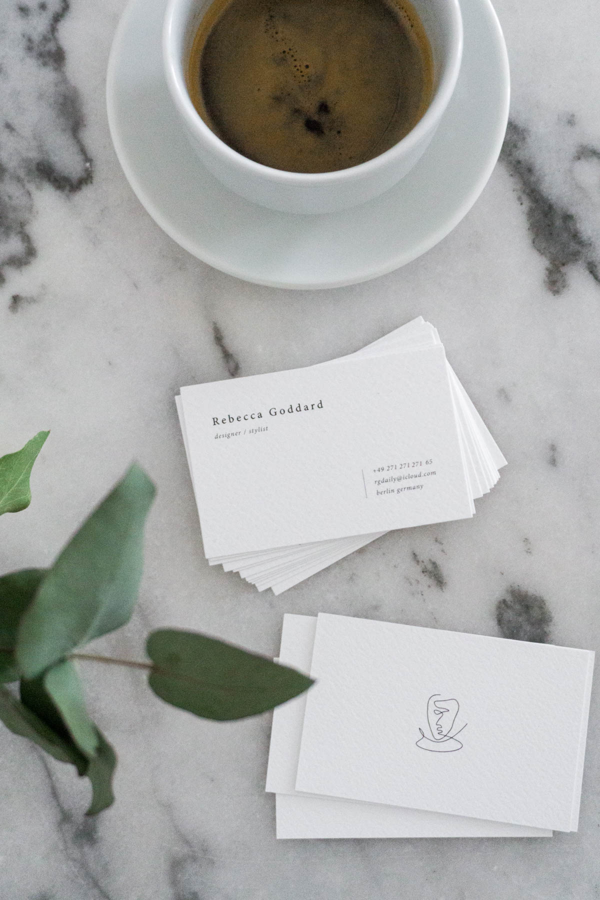
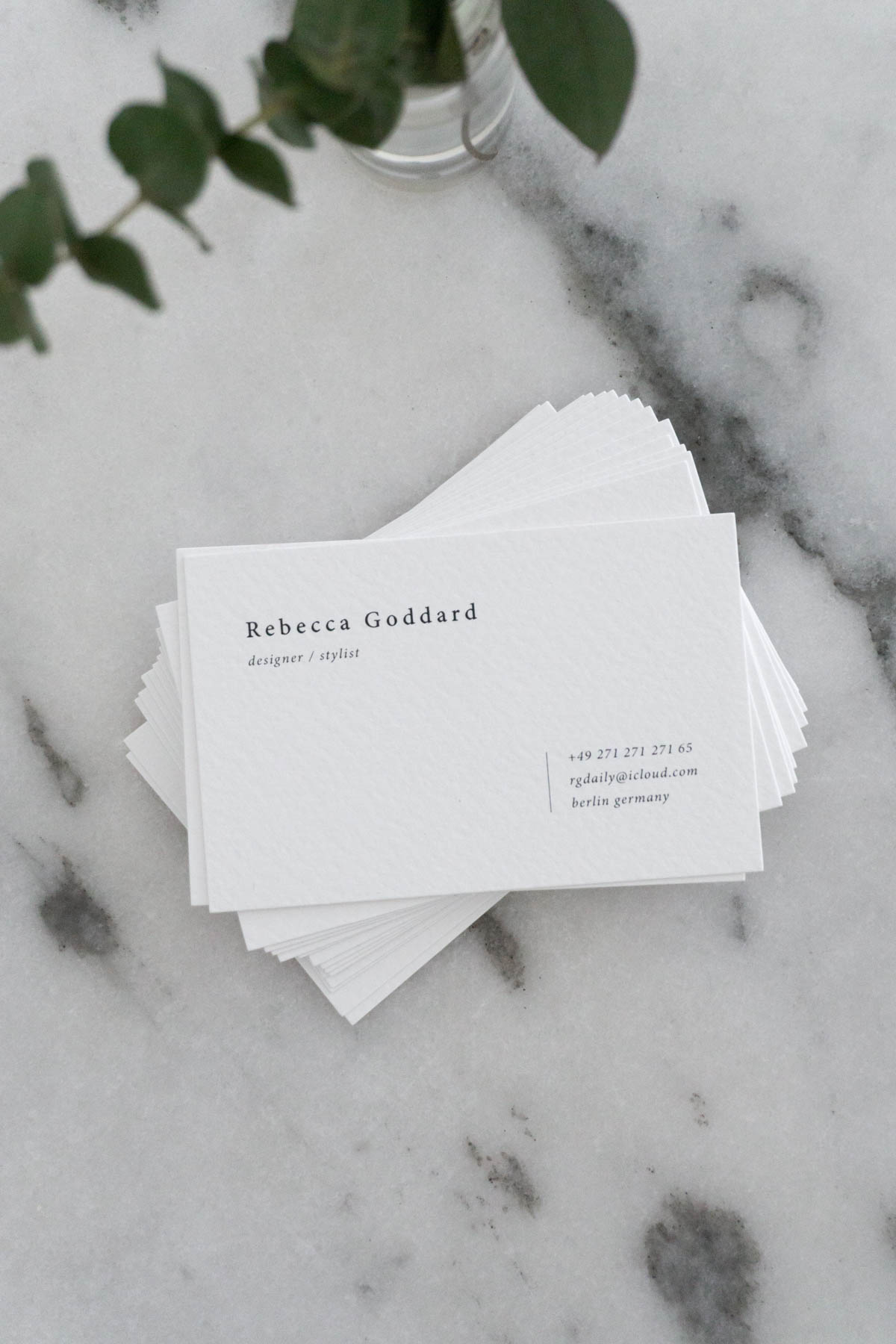
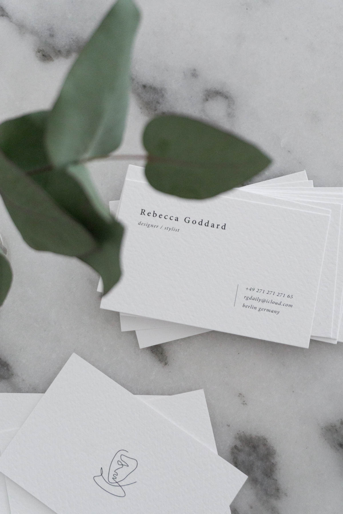
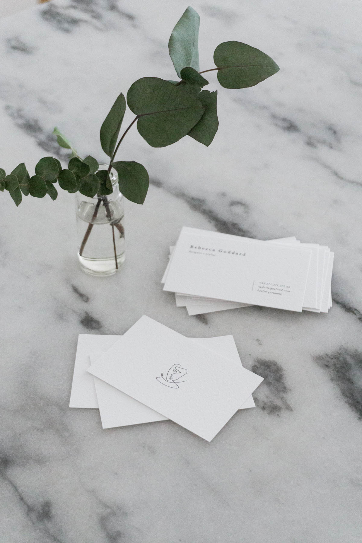
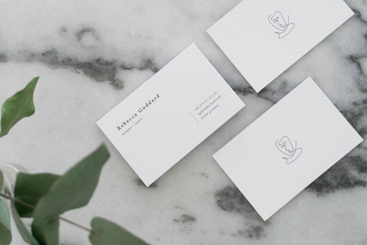
My new business cards arrived and I’m pretty thrilled with the quality!
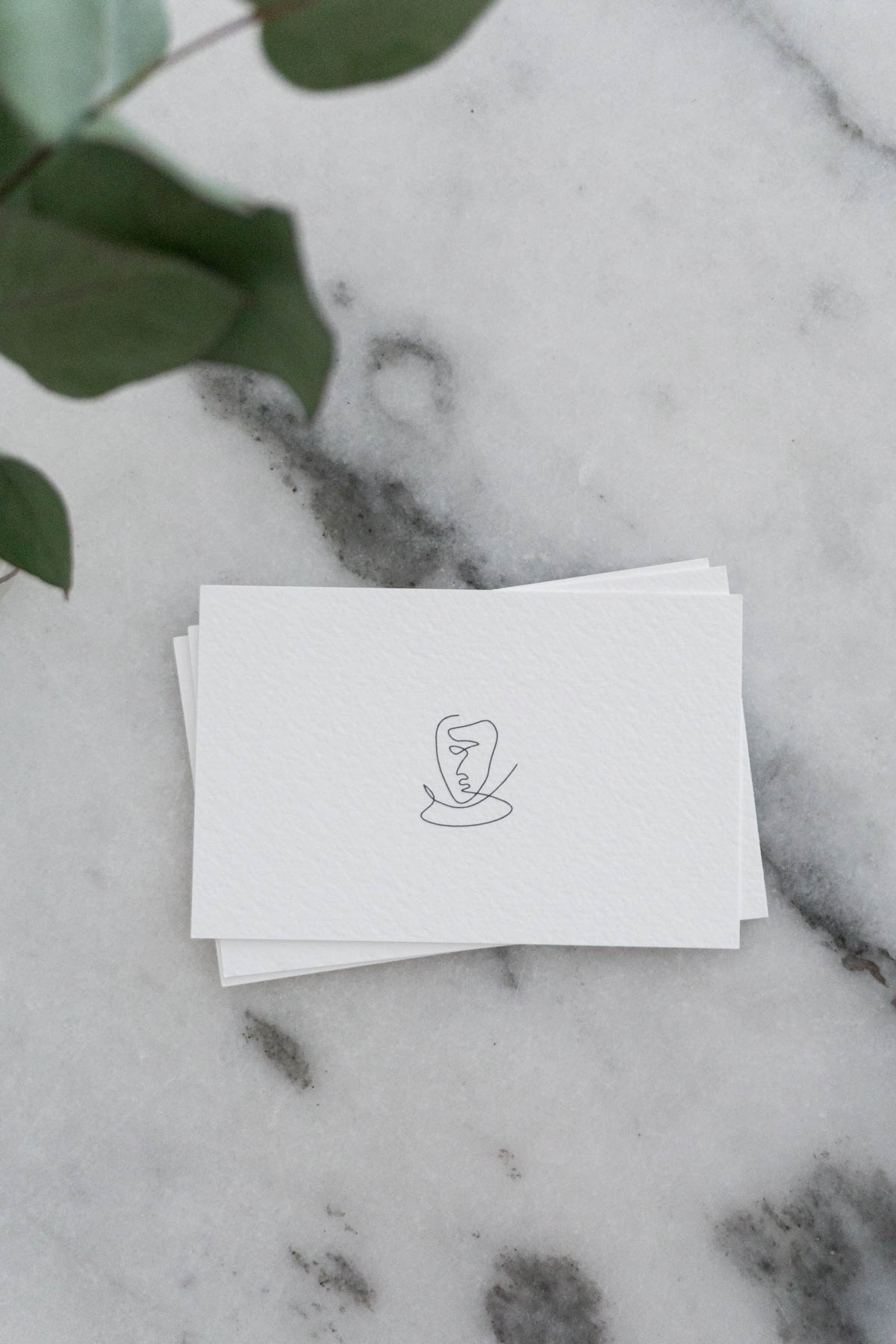
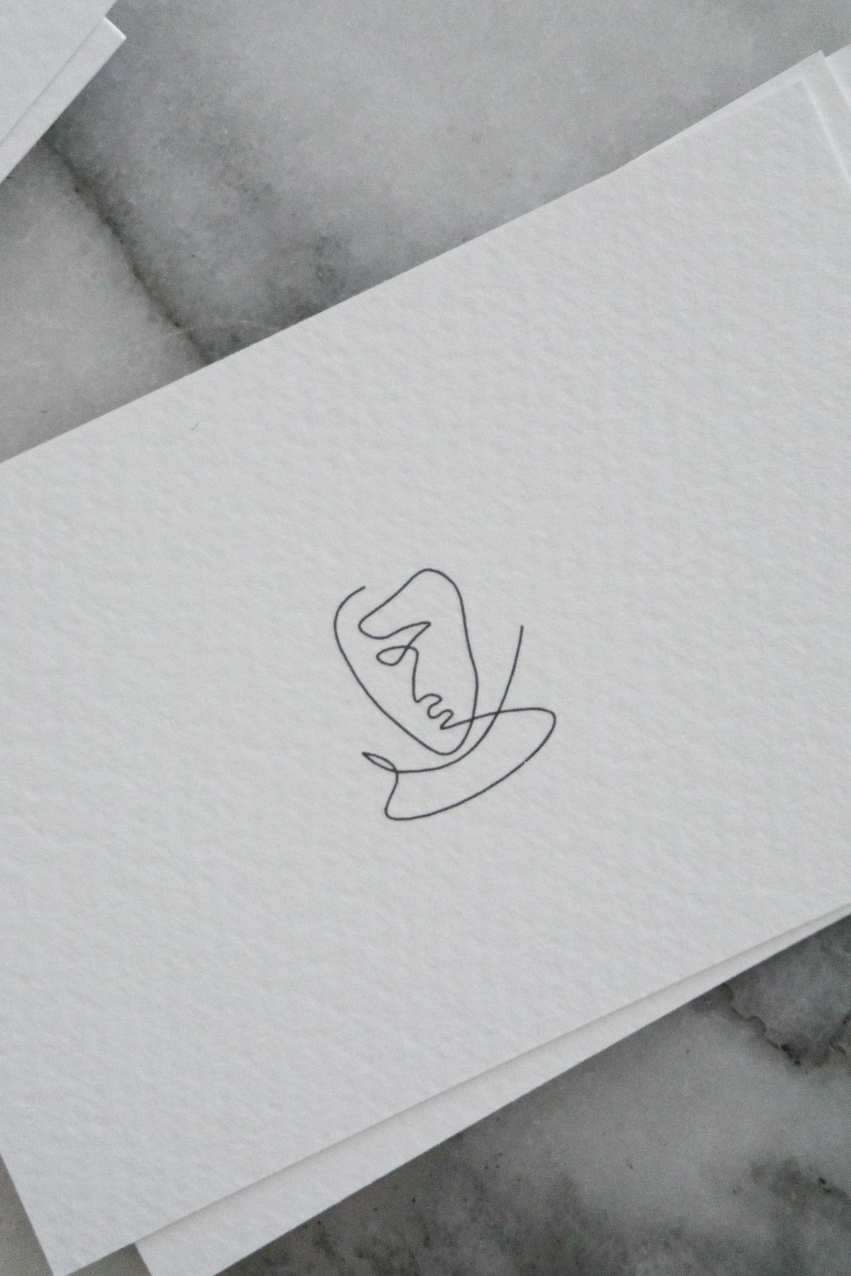
I wanted a card that would be clear, timeless, and reflect a little bit of my personality – gosh, am I boring! After a few hours of doodle sketching, I came up with this little design for the back. It’s just a simple reminder that we’re all the same. Like the contentious line drawing, everyone starts and ends somewhere. It’s what happens in the middle that makes things interesting, and it’s probably going to be a little bit messy. The same principal holds true for design I think.
–
I have edited the phone number on this card for privacy reasons of course. So, if you’re looking to get ahold of me via phone, you won’t have any luck by calling this number. But I’m happy to respond to your emails!